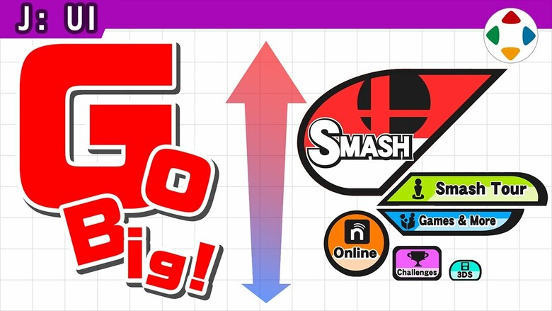
I’m sure there are fans out there as well, but I have always hated these types of menus in Sakurai’s games.
It makes sense on paper but is too disorienting to internalize.
When a game has a list of options, and sublists under them, it’s easy to internalize them as a tree structure in my brain and remember where everything is.
With these crazy icons haphazardly placed up, down, left, right, sometimes diagonally, a small round button in the corner and a big half-pill shaped one slightly left of center, only to go into a subtree where positioning, size, shape, and colors are another completely different layout, it’s incredibly difficult to internalize where everything is.
Again, it sounds super intuitive on paper but in practice has never appealed to me as a player.
Edited 1 time

